I've been asked to share a glimpse into the making of a book cover. Here's a brief overview of what I put into one particular cover.
Every cover is made up of layers. How you order those layers determines what shows and what doesn't. Makes sense, right? You can also use transparencies to make lower layers show through upper layers.
These layers are made up of pictures (photos or drawings), fonts, and some effects will actually have their own layer(s).
As an example, I've selected Linda Boulanger's cover for her sweet contemporary romance novella, Arms of an Angel.

You can see here all the layers used in this cover:

That's right, there's only four layers involved in this particular cover (for the front, anyway). The font layers could have been put into one layer but the effect I used on the author name I didn't want applied to the title. Thus, they needed to be in separate layers.
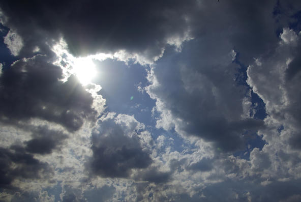
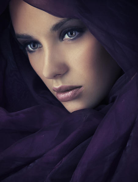
You can see the first thing I did was mirror the woman. Very simple change. Next, I positioned the cloud pic beneath the woman.
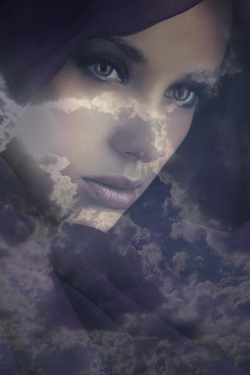
Now, this is where transparencies come in. Obviously, if I simply put the cloud pic underneath, the woman would completely hide it. We want it to seep through. So, I changed her transparency to 56%, allowing the clouds to shine through just enough to give that otherworldly, heavenly feel. This is what I got:
You can see the first thing I did was mirror the woman. Very simple change. Next, I positioned the cloud pic beneath the woman.
Now, this is where transparencies come in. Obviously, if I simply put the cloud pic underneath, the woman would completely hide it. We want it to seep through. So, I changed her transparency to 56%, allowing the clouds to shine through just enough to give that otherworldly, heavenly feel. This is what I got:
Then I added the fonts. Finding the right ones can be the most time-consuming part of a book cover design. NEVER UNDERESTIMATE THE IMPORTANCE OF THE COVER'S FONT. Font choice and placement have as much to do with a great cover as the graphics themselves.

Fancy fonts aren't always the best way to go either.
You can see here that "Angel" is really the only fancy font I used. There's a reason for that. I wanted to draw attention to the word Angel, to match the heavenly aspect of the cover graphic itself. At the same time, the other words are by no means "lost" in the rest of the design; rather, they complement each other. The design becomes a whole picture, rather than many layers all smashed together.
That's it for this blog post. I hope it helped you understand a little better what's involved in a great cover. I welcome questions. Thank you for stopping by!
 RSS Feed
