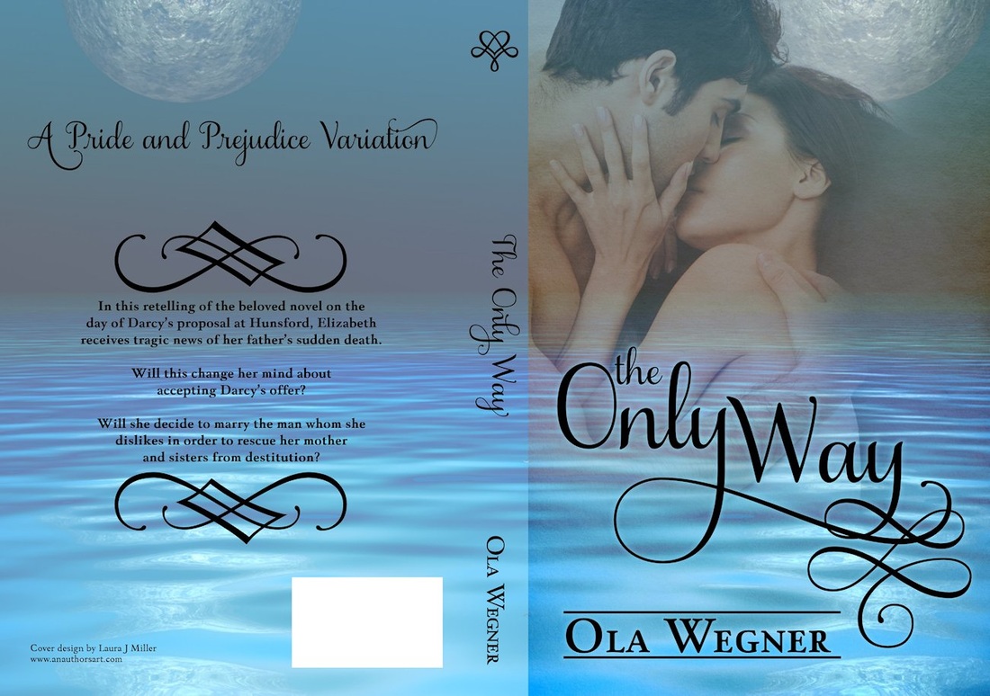
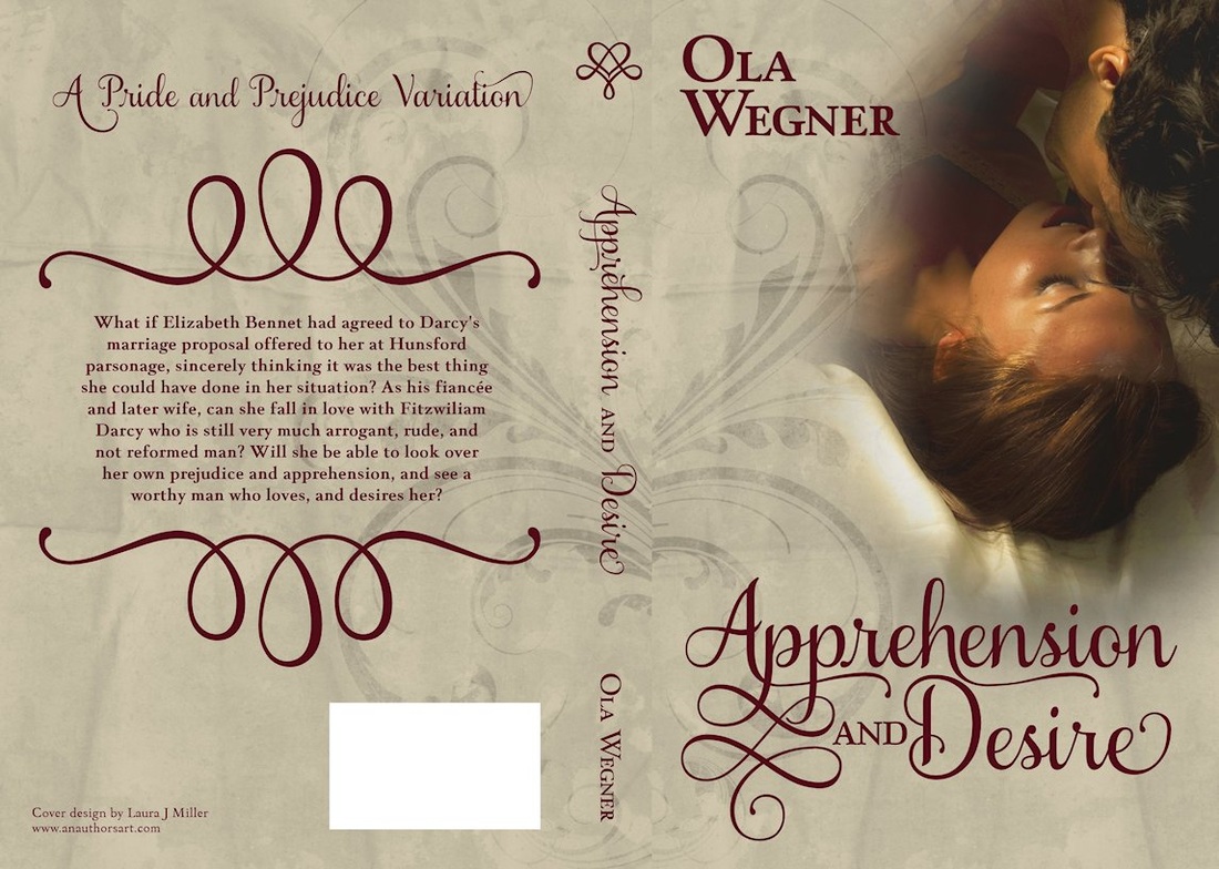
Add Comment As of February 1, 2012, An Author's Art has joined forces with Linda Boulanger of Tell-Tale Cover Design and TreasureLine Designs. As required by this partnership, my prices have gone up. Some will say it's worth it and some will move on to other designers. Either way works for me. ☺ The new prices are as follows:
You may be wondering why I'd make this decision. I started this cover design site just over a year ago. It was meant to be a hobby, not a career. And though I've come nowhere near making enough to support my family, I've had more cover orders than my personal time will allow. As a result, writing took a bit of a back seat and for a writer, that's just not acceptable. Watch this blog for updates and new covers. I'm going to attempt to be more diligent about blogging too. ☺ I'm raising the price of print covers starting Jan 1. The fee now is $65; it will $75 starting January 1st. E-book covers will remain the same at $50 and premade covers will remain at the prices posted on the site. The only rate change will be full spread (front, back, spine) print covers. Please make a note of this. If you want to get in at the $65 rate, you need to contact me no later than Dec 31, 2011, 11:59 PM (EASTERN TIME). No exceptions. Thank you. As of today, I am now offering premade covers. These designs require nothing more than the addition of a title, author name, and an optional tagline. These are suitable for eBook use and in some cases, if a full-spread print cover is desired, arrangements can be made. Here is a taste of the covers I'm offering. I'll periodically post new ones to this blog so you can see what I'm doing. Check out the new gallery and let me know what you think! :O) I was interviewed for Riverina Romantics blog. The interview is all about my cover design half and is set to post July 14. I hope you can stop by and leave a comment! Have a creative day!! My latest cover commission from TreasureLine Books was Wickflicker by Teric Darken. While I can't claim this cover idea as my own (all that credit goes to Linda of TreasureLine) I executed the design. Teric Darken's supernatural allegory is due to hit the shelves mid-July. DARKSPELL by Elizabeth Mueller. This was one of my easier covers. Elizabeth provided the picture of the boy, already manipulated to look older and darkened to add that mysterious, paranormal quality. With some suggestions from Linda, owner of TreasureLine, and further ideas from Elizabeth, this cover was finally born. Oh, and a special little factoid about this particular cover model: he is Elizabeth's 11-year old son, manipulated (by Elizabeth) to look like the 17-year old MC. How cool is that? A new cover has been unveiled for TreasureLine Publishing's eclectic list of titles, Whisper A Scream. This cover, as is usually the case, was a collaborative effort, using my ideas along with Linda Boulanger's (TreasureLine's owner) and Pete Turner's (the book's author). Without being able to work closely with publisher and author, my covers couldn't be as good as they are. I've been asked to share a glimpse into the making of a book cover. Here's a brief overview of what I put into one particular cover. Every cover is made up of layers. How you order those layers determines what shows and what doesn't. Makes sense, right? You can also use transparencies to make lower layers show through upper layers. These layers are made up of pictures (photos or drawings), fonts, and some effects will actually have their own layer(s). As an example, I've selected Linda Boulanger's cover for her sweet contemporary romance novella, Arms of an Angel. You can see here all the layers used in this cover: That's right, there's only four layers involved in this particular cover (for the front, anyway). The font layers could have been put into one layer but the effect I used on the author name I didn't want applied to the title. Thus, they needed to be in separate layers. You can see the first thing I did was mirror the woman. Very simple change. Next, I positioned the cloud pic beneath the woman. Now, this is where transparencies come in. Obviously, if I simply put the cloud pic underneath, the woman would completely hide it. We want it to seep through. So, I changed her transparency to 56%, allowing the clouds to shine through just enough to give that otherworldly, heavenly feel. This is what I got: Then I added the fonts. Finding the right ones can be the most time-consuming part of a book cover design. NEVER UNDERESTIMATE THE IMPORTANCE OF THE COVER'S FONT. Font choice and placement have as much to do with a great cover as the graphics themselves. Fancy fonts aren't always the best way to go either. You can see here that "Angel" is really the only fancy font I used. There's a reason for that. I wanted to draw attention to the word Angel, to match the heavenly aspect of the cover graphic itself. At the same time, the other words are by no means "lost" in the rest of the design; rather, they complement each other. The design becomes a whole picture, rather than many layers all smashed together. That's it for this blog post. I hope it helped you understand a little better what's involved in a great cover. I welcome questions. Thank you for stopping by! Oh my. Today, I'm all about Dreamstime. I spend a lot of time there anyway, but this morning I bought a one-week subscription to help build up my stock of photos for cover use. A subscription allows the purchaser to download up to 10 photos per day in any size they prefer. This is fabulous for me, who has the means to shrink photos. I can download the largest size offered and then cut, shrink, or expand as needed. Fabulous! To check out Dreamstime, head over to their free stuff (click HERE), just to get yourself started. This is a great resource if you just want/need a pic for a blog post or article. Registration is required but it's free. Have a lovely, creative day! |


RSS Feed